Using Technology to Protect Our Ocean
As our Pollution Tracker team wraps up another field sampling season, it’s time to analyze our newly collected data. In this blog, we explore how we use tools to analyze our data, and how the data can be used to inform future conservation measures.
What Kinds of Data Does Pollution Tracker Collect?
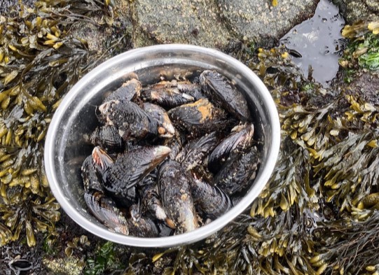
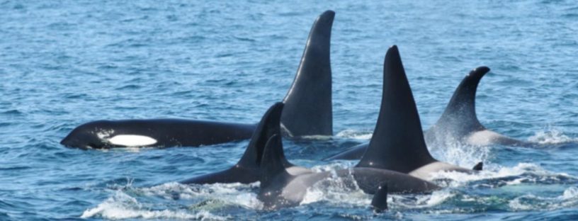
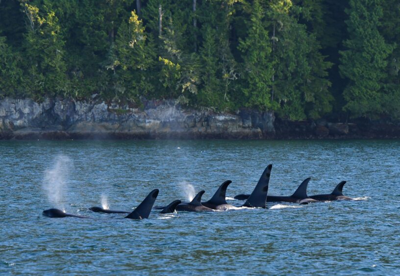
Our Pollution Tracker program has been monitoring the health of British Columbia’s coastal waters since 2015. We collect samples of sediment and mussels from various sites along the coast to track pollution levels in the ocean. Over the years, we’ve gathered a vast amount of data that helps us understand what kinds of harmful substances are in our waters. These include everything from everyday chemicals found in personal care products to more dangerous pollutants like flame retardants, pesticides, toxic metals, and petrochemicals. With this data, we aim to identify areas of concern for marine species, like killer whales and Chinook salmon.
We’ve gone through different phases of this project, each one building on the last. For example, the data collected between 2018 and 2020 (Phase 2) added to what we learned from our earlier work (Phase 1). We’re currently analyzing data from Phase 3, which started in 2021, and we’ve just kicked off Phase 4. Check out this blog for what a sampling day looks like! Each phase helps us get a clearer picture of how pollution is changing over time and across different areas.
How We Use Technology to Support Our Work
To manage the huge amount of data we collect, we use a powerful database system called EarthSoft’s EQuIS™. Recently, we’ve integrated this system with the EQuIS REST API, which allows us to create more interactive and easy-to-understand reports using a tool called Power BI.
Power BI helps us to turn our data into visual reports such as charts, maps, and dashboards (Figure 1) that make it easier to see patterns and trends in pollution. For instance, we can automatically calculate the total amount of a particular contaminant in samples across different phases and compare these results to safety guidelines. This helps us quickly detect changes in contaminant levels, identify areas that might be at risk, and effectively communicate our findings to partners and supporters through clear and visual presentations.
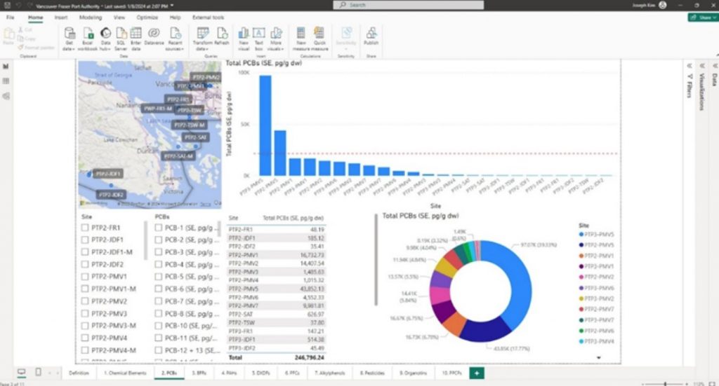
Figure 1. An example of a Power BI dashboard displaying Pollution Tracker Phase 1 and Phase 2 data (Ocean Wise)
How Can This Help with Conservation Work?
These technologies won’t just make our data easier to understand — they’ll also help us take action. For example, by using Power BI, we could create interactive maps that highlight potential pollution hotspots. This would mean that if we were to identify an area with particularly high levels of contaminants, we could alert decision-makers who might then prioritize that area for cleanup efforts. Over time, we could also monitor how effective those efforts are.
Power BI might allow us to make connections between pollution levels and other factors, like proximity to shipping lanes or industrial activities. By understanding these connections, we can better plan for the future and take steps to prevent pollution before it happens.
Learn more about the Ocean Wise Pollution Tracker here, and stay tuned for updates.
Acknowledgement
This project was supported partially by a financial contribution from Fisheries and Oceans Canada / Ce Projet fut partiellement appuyé par une contribution financière de Pêches et Océans Canada.
Posted October 31, 2024 by Cayley Elcombe
